Axiom
Uncomplicated data analytics, visualization, and reporting that really packs a punch.
Simplify Your Analytics
Every Canary System includes a license for Axiom, Canary's data visualization and analytics tool. Axiom has been designed from the top down to be easy to use, but simple doesn't mean watered down. Axiom is full of features that were developed specifically for process engineers and control operators. We've used our twenty plus years of trending experience to deliver a set of tools that will help you maximize your operation.
Using Your Process Data Should Be Easy
Built in HTML and Server-Centric
To make sure Axiom could be used by as many clients as possible, everything has been built in HTML. That way, the only requirement for a client to use Axiom is a modern web browser.
Updating Axiom to the latest version is simple. Upgrade the server and when a client connects, they automatically receive the newest release.
All Axiom architecture is server centric. Data processing is handled on the Canary System server, not at the client, giving your clients a high performance experience every time. Additionally, since it's server based, Axiom applications and trend charts are stored on the Canary server instead of on local client machines
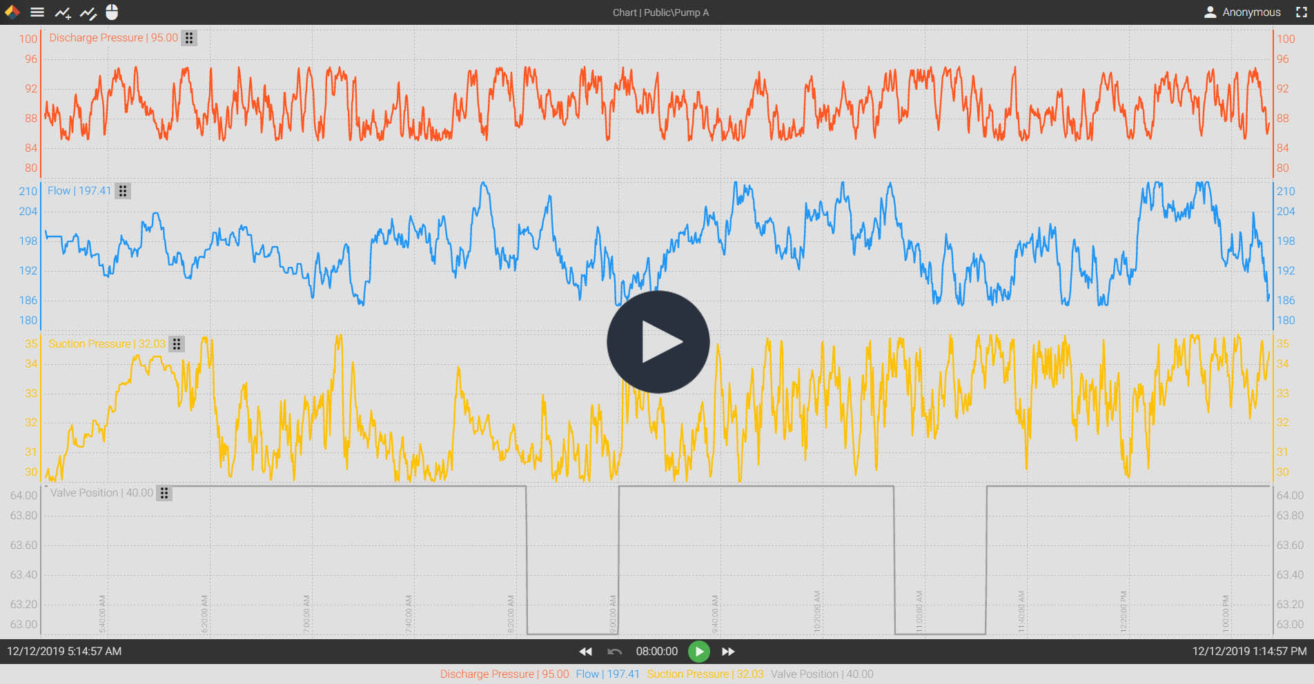
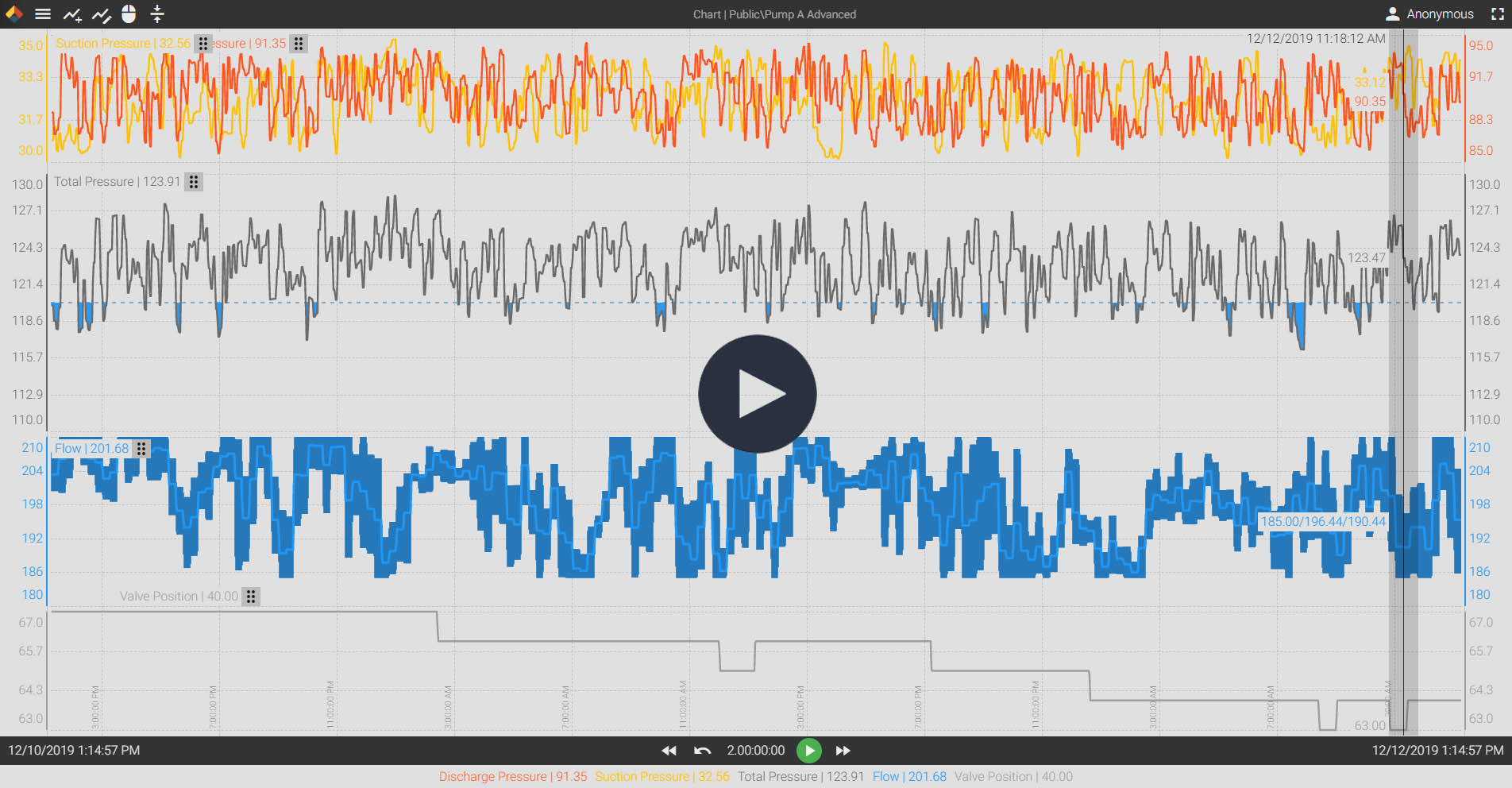
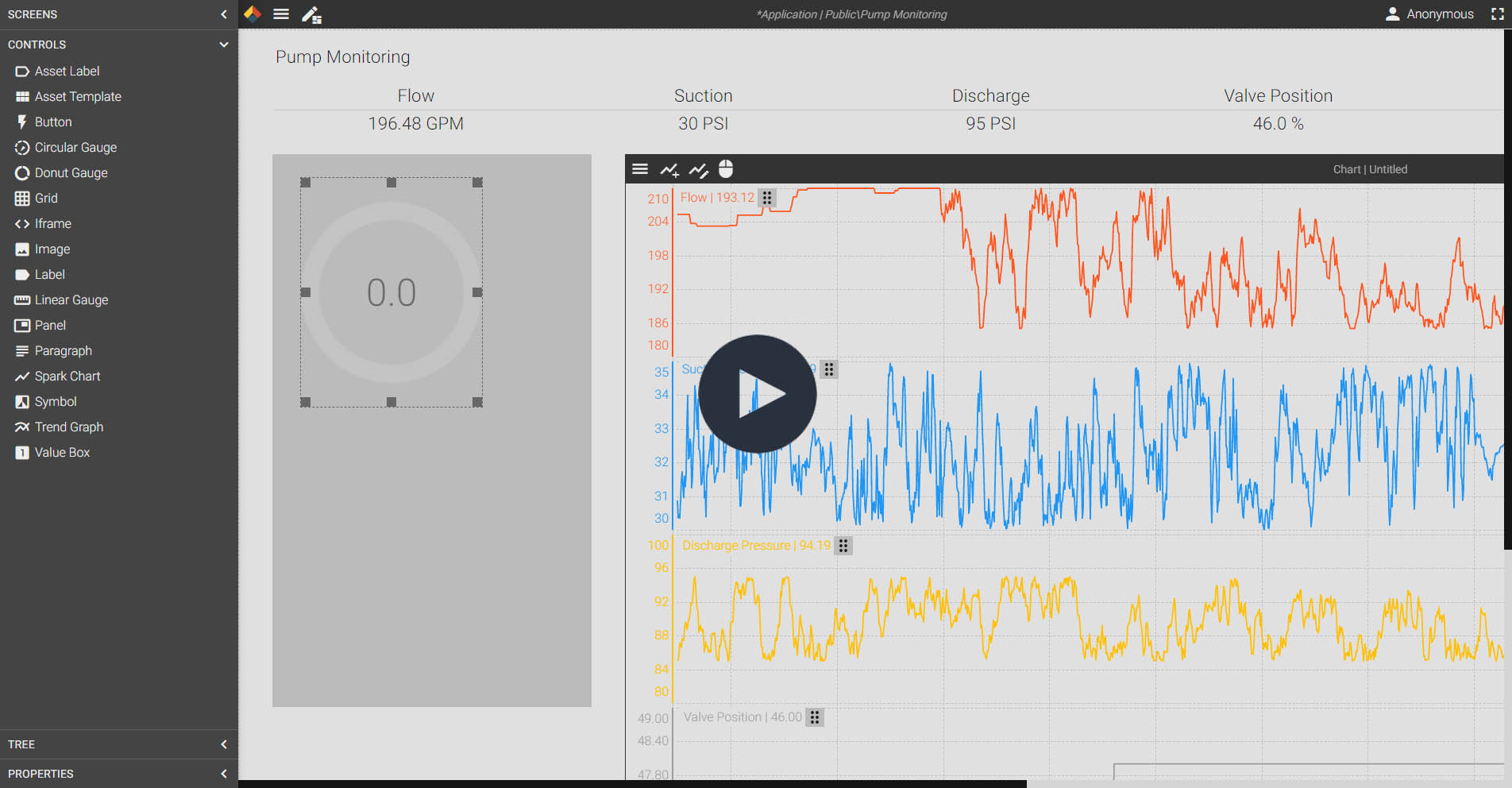
Seriously Powerful Data Trending
At it's most basic level, Axiom can serve as a trending tool. You can use it to study trend patterns, compare different data streams, and visualize years of historic data. But you can also do much more. Axiom's trend charts are loaded with useful tools you can use to view your data in a myriad of ways.
With Axiom trend charts, you can:
- Perform adhoc calculations using multiple trends
- Run statistical analysis of historic data
- Compare tags from Canary Events
- Export data to .CSV
- Time-shift tags for seasonal comparisons
- Create time buckets of aggregated data values
- And much, much more
You can empower every member of your team to become a trending pro. Most users are able to use Axiom trend charts in just ten minutes of training. Gaining data access to that degree gives everyone access to the data they need to make better operational decisions.
Want to try it out for yourself? Give Axiom a test drive on Canary's demo server.
Easy To Use Trend Charts
Advanced Trending Tools
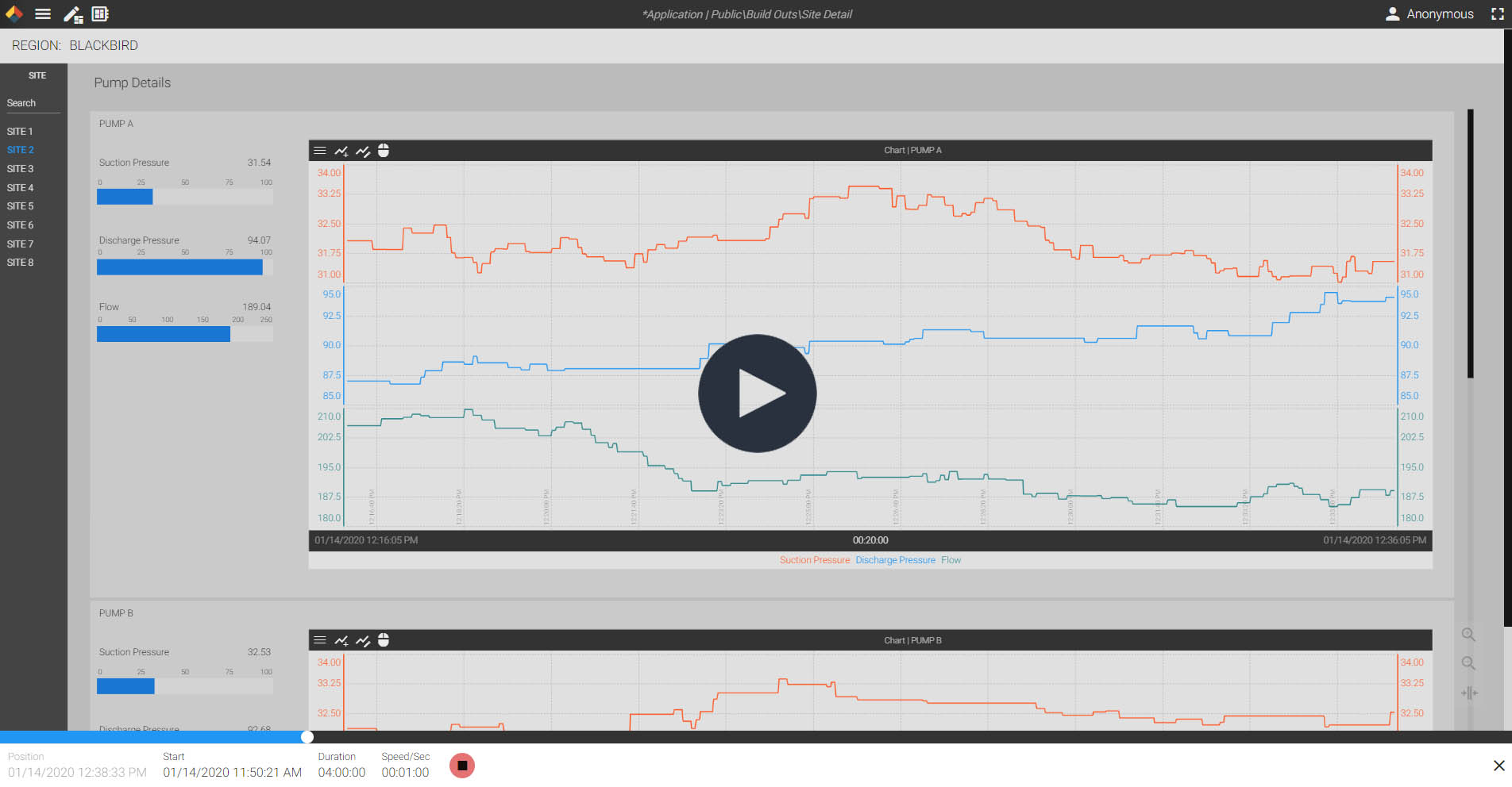
Build Your Own Applications and Replay Historic Events
With the built-in application designer, Axiom can do a lot more than just trend data. In fact, anyone that has access to Axiom has the ability to create their own HMI visualizations and reports. That means, every member of your team can be a data rockstar.
Need to find out why a piece of equipment failed or investigate an event? Use the playback feature to rewind time and watch what happened in 'real-time'. You can even interact with the application or trend chart while replaying the data.
Build Your Own Applications
Playback Historic Events
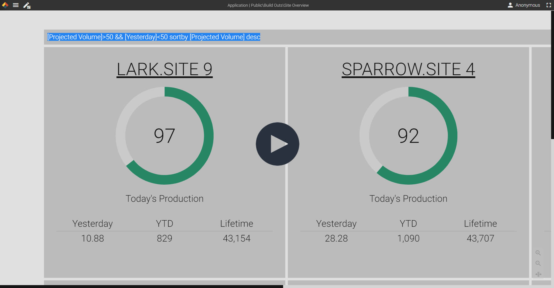
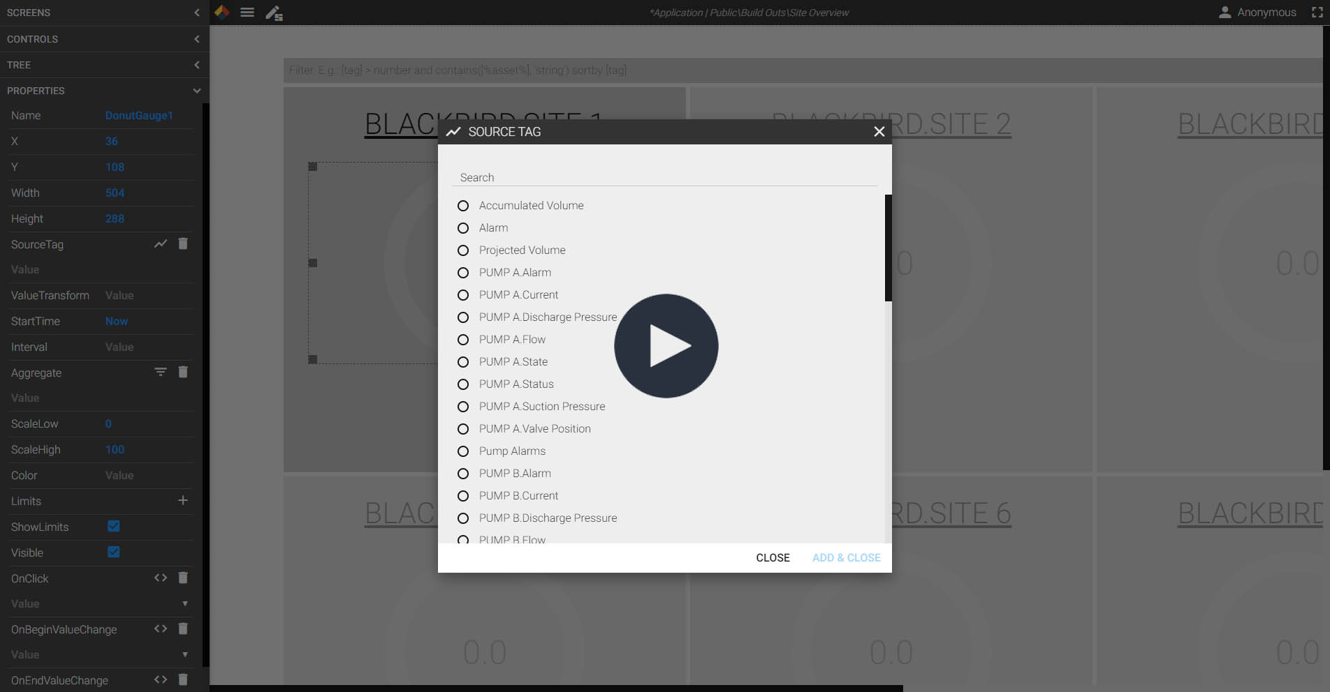
Asset Models Make It Even Easier
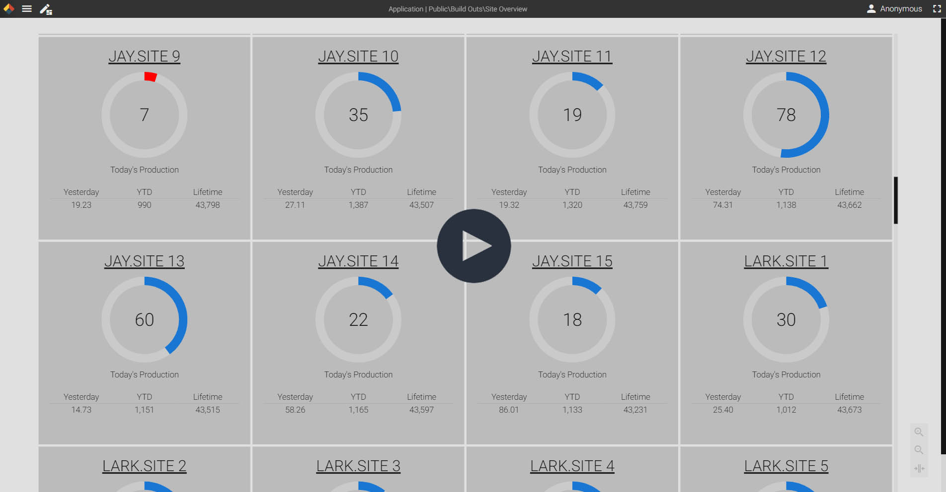
Every time you create a new Virtual View, Axiom can be used to visualize your assets. Instead of spending hours of time trying to create reports for hundreds or even thousands of assets, you can use Axiom's built-in asset tools. Simply design your visualization for a single asset, and let Axiom duplicate that design for every asset instance. As new assets are added, the Canary System automatically discovers them and Axiom is updated.
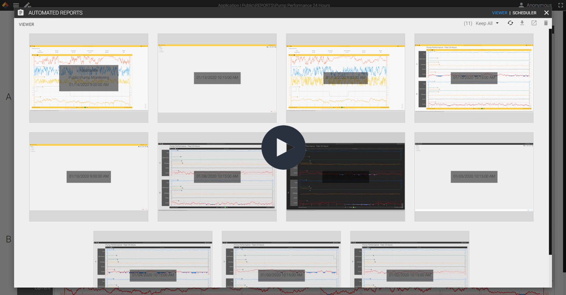
Automate Reporting
Visualize Entire Groups of Assets
Filters and Reports Save You Time
The filter option is sure to save you hours of work. Instead of spending time looking through data tables and trend charts for specific conditions, apply a filter. Now, only the instances that meet the conditions will display.
Take it a step farther and deploy your application as an automated report. You can schedule a snapshot of a trend chart or an application to be sent to your inbox. Now you can start every shift with a list of assets that need your attention or end each day with production numbers automatically distributed to your team.
Navigate Through Asset Groups
Filter Assets by Condition